In the morning, we had the intro to Design Domain Pt.2, where Jen and Catherine, recapped some of which was involved in Pt. 1 and then went on to discuss Pt. 2.
During the day, I thought over my proposal from Pt.1 and have decided to alter some aspects of it.
My original idea was; to create posters comparing the differences in the the decades of 1910s and 2010s. This was going to relate to the different way people were brought together. I was initially going to do this through; Adobe Photoshop, Adobe Illustrator and Adobe Spark. I initially only looked at ‘Why Do We Imagine?’
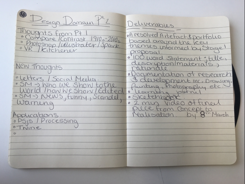
However, I have decided to change my idea, I still want to create some sort of poster or graphics. That compares propoganda from the early to mid 20th Century. and Social Media, as these are what brought people together in their current ages.I have decided that I want to perhaps make some of these aspects of the poster in Processing. I now want to also look at ‘Who We Are?’ as well as ‘Why Do We Imagine?’.
- From the Tutorial – These are some things that were said;
- Tim Rodenbröker – Graphic designs
- where does the propaganda end?
- Parameters / rules / framework for Posters
- Typography
- Framework
- Series
- Political / Internet / Free System
Tim Rodenbröker
Below is some screenshots of work by Tim Rodenbröker.
Rodenbröker : “To visualize the restrictions of the project, i usually make use of a creativity-technique called “The Magic Triangle”: Each border of the shape represents one rule or restriction. All 3 borders together build a frame around the creative space, which is literally the area where the ideas exist.”


Friday Tutorial
Weekend/Monday
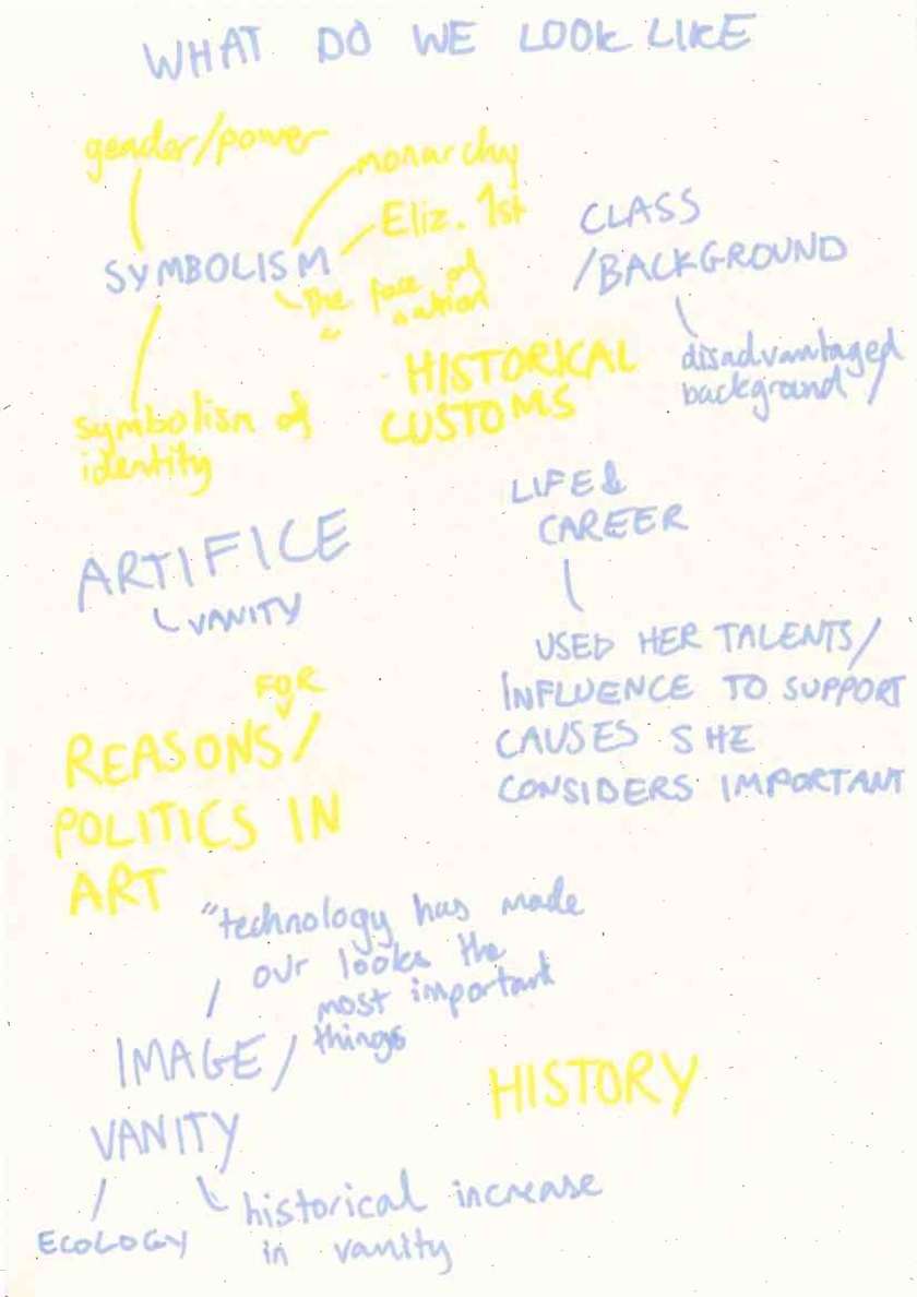
Over the weekend, I decided to do further research on the impact social media has on a political level. As platforms are used by both; people of political power, who use it to reach out to their audience and further their political agenda. But also the everyday person that uses it. Below are images of my notes.


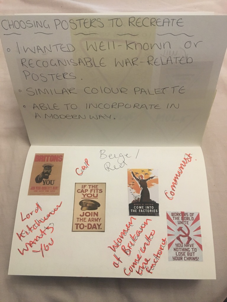
Time to chose the posters to edit.


I chose these posters as they are all posters with a Propaganda based message. They all had a similar colour palette, which I though would make the recreation easier. Also I feel they all had both a centre image as well as large text surrounding, which are aspects I want to incorporate into my ‘rules’ for the project.
Break down from each poster recreation process.
The poster recreating has been completed using Processing, but some aspects were modified in Photoshop so that they would could fit in the right location
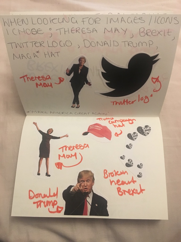
Donald Trump / ‘Lord Kitchener Wants You’
Initially I went looking to Twitter to find some of Trump’s Tweets, as he is know for being an avid user of the site.


I thought that I could utilise some if these tweets in the poster.
In Recreating the poster I tried to keep the colours* and layout of the poster the same as the original.

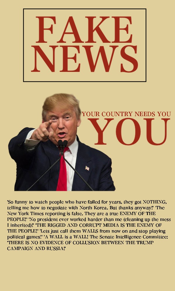
*when creating the posters I realised that the colour I took was the wrong shade, hence the different colours in the progression of the poster.
A difficulty I had when creating this poster was arranging the text to be in the specific location I wanted.

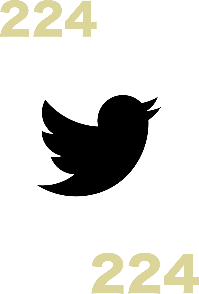
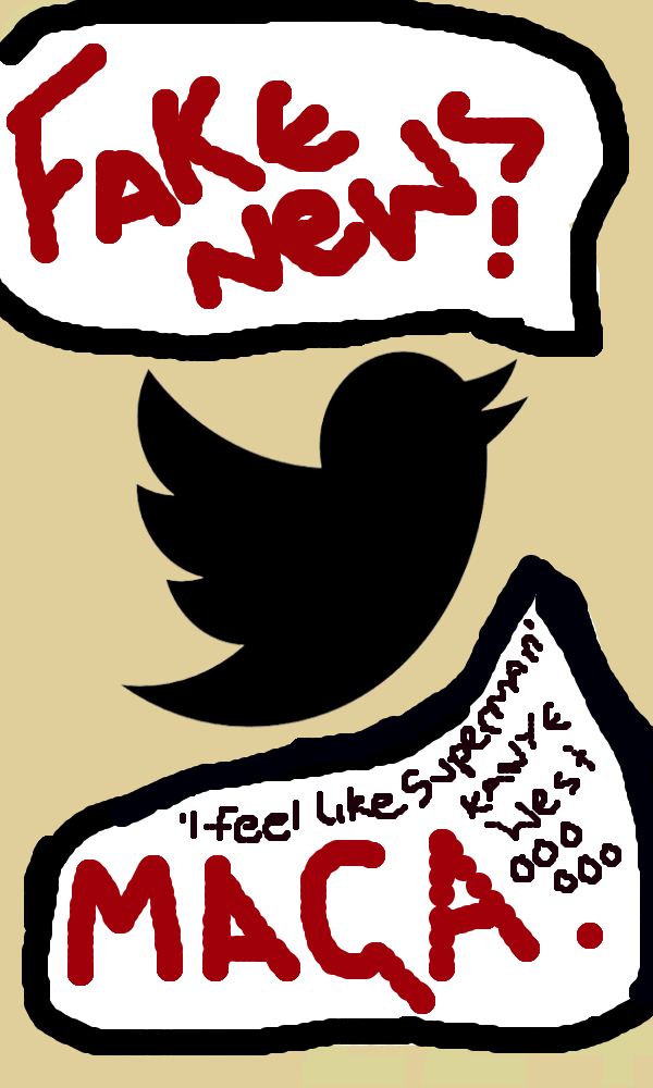
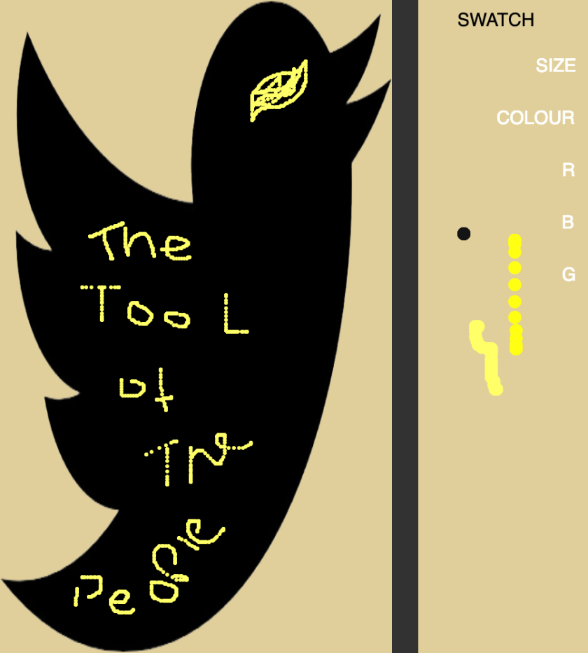
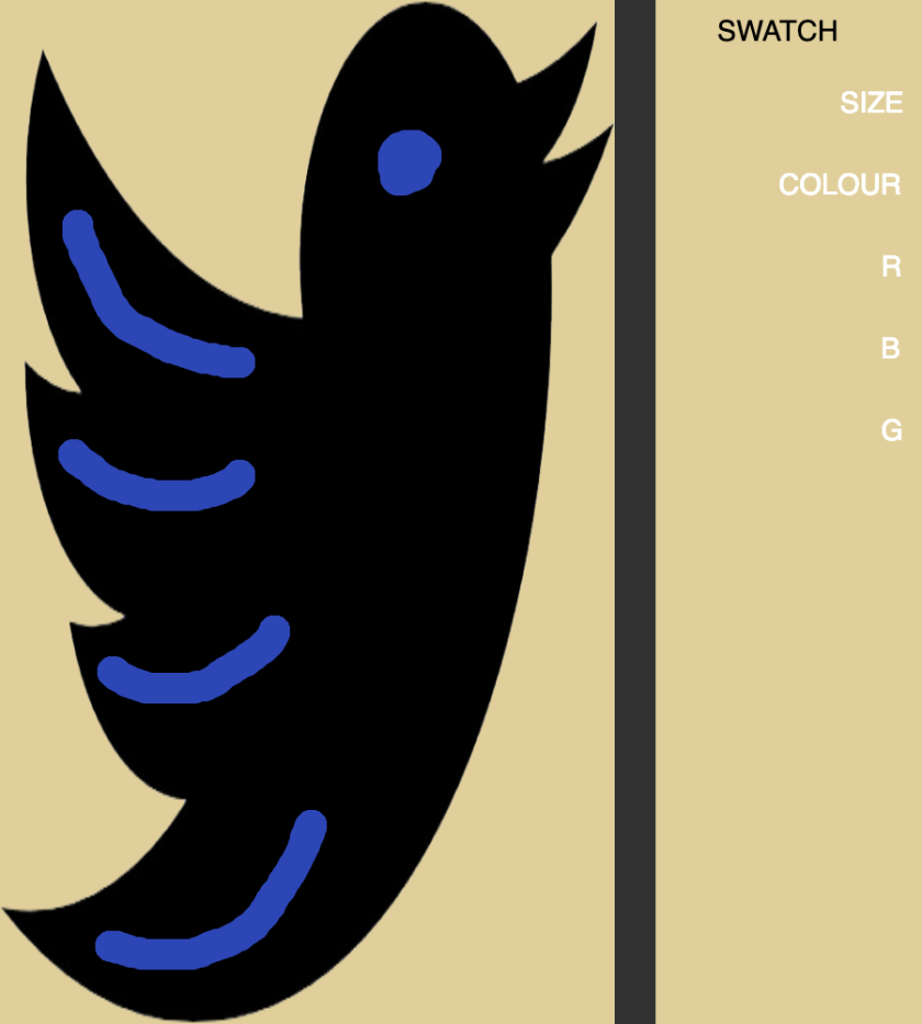
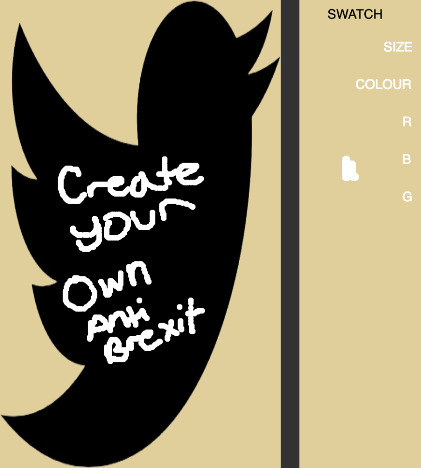
Twitter / Communist Poster
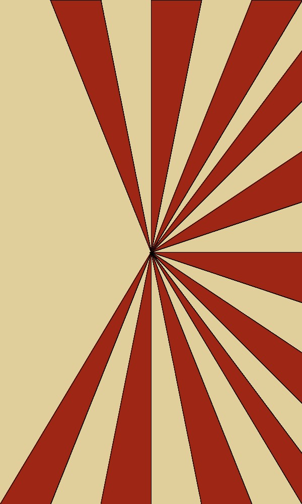
I found this to be probably the most interesting to make, as I got to experiment with triangles, which is something I hadn’t really used in processing even though it seems rather basic.
I used the Twitter logo, as it both is the most active social media for politics and political related events. Also as it relates to the Design Domain Question, ‘Who We Are?’, I feel that as a society we greatly invest in social media culture and Twitter is one of the main sites for this kind of interaction. As of 2018, Twitter has 326 million users.
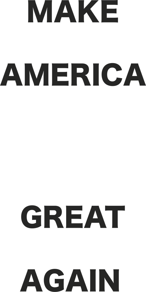
I also included the text of ‘Make America Great Again’, as it relates to Trumps Campaign slogan, that is frequently used in as a hashtag in social media.


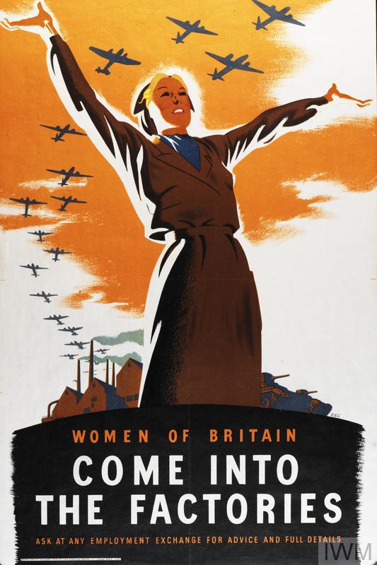
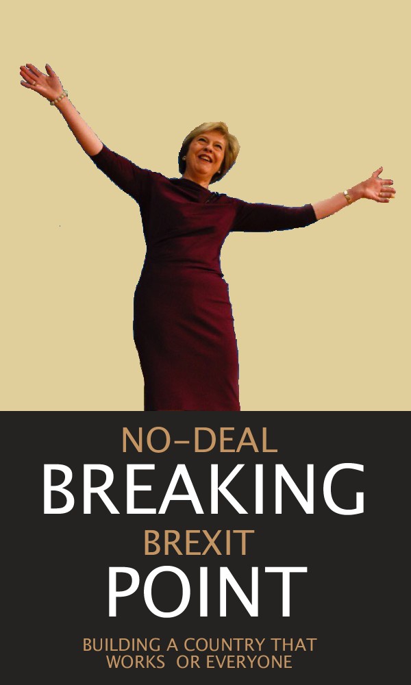
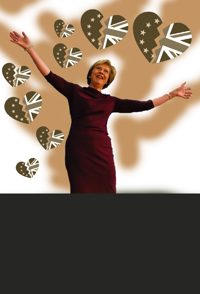
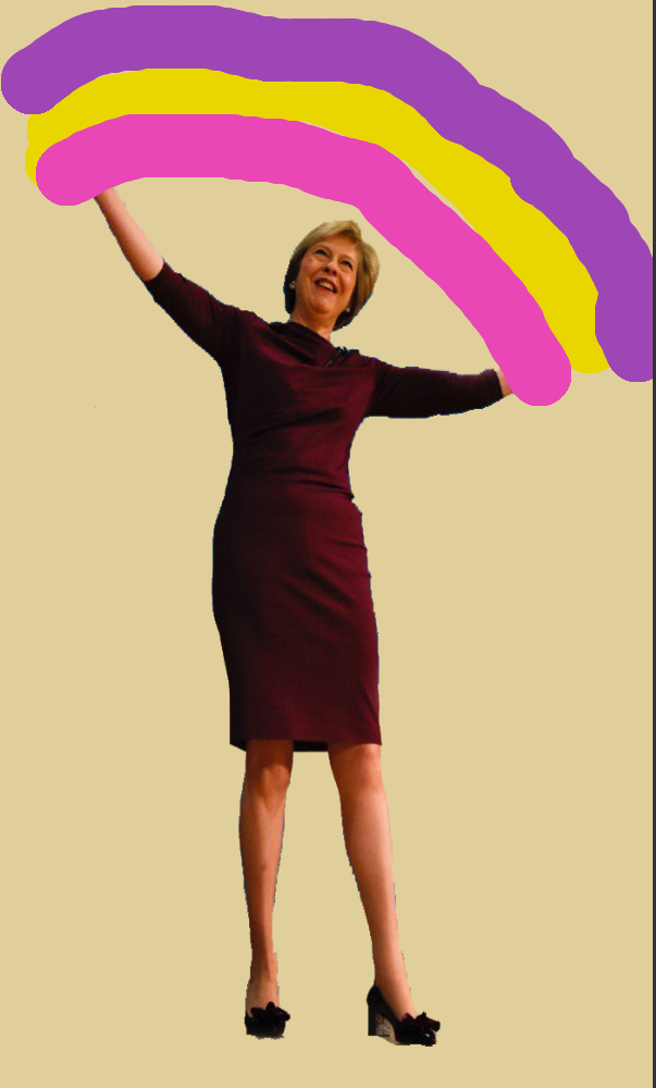
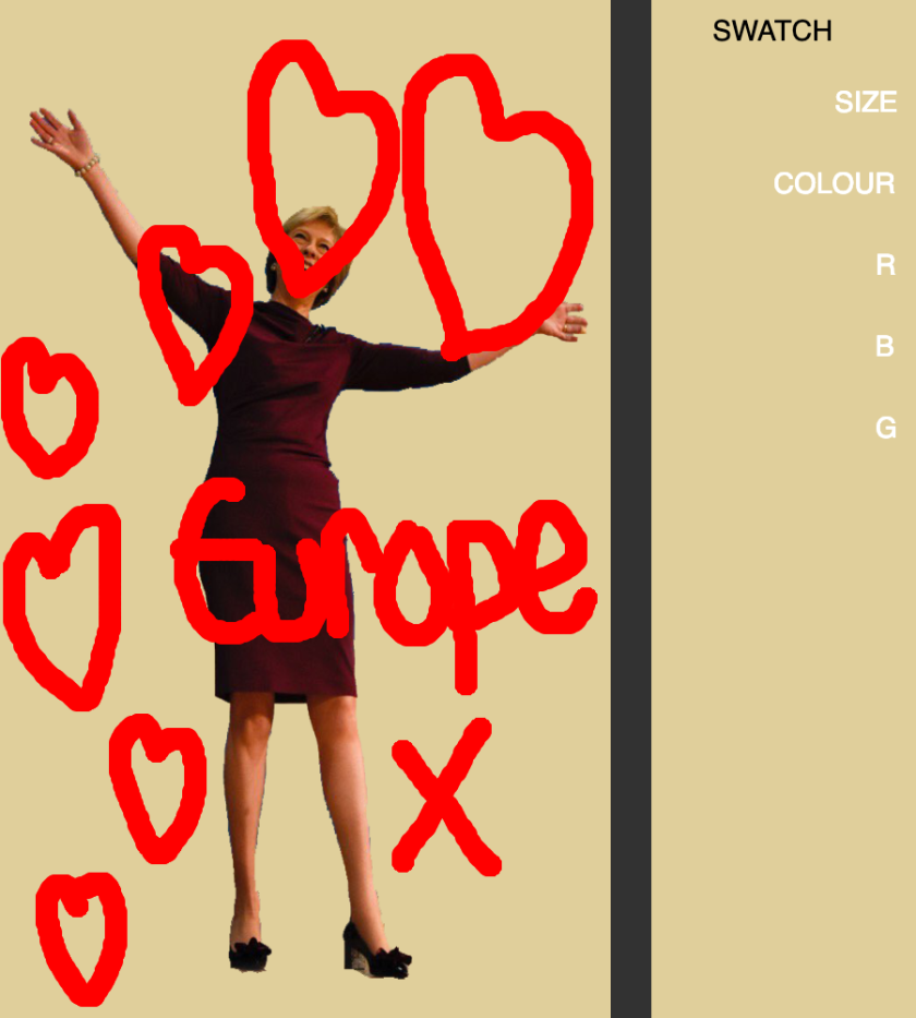
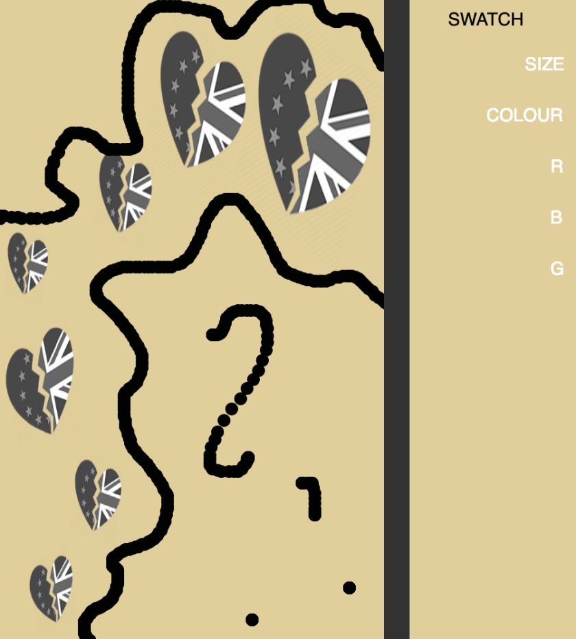
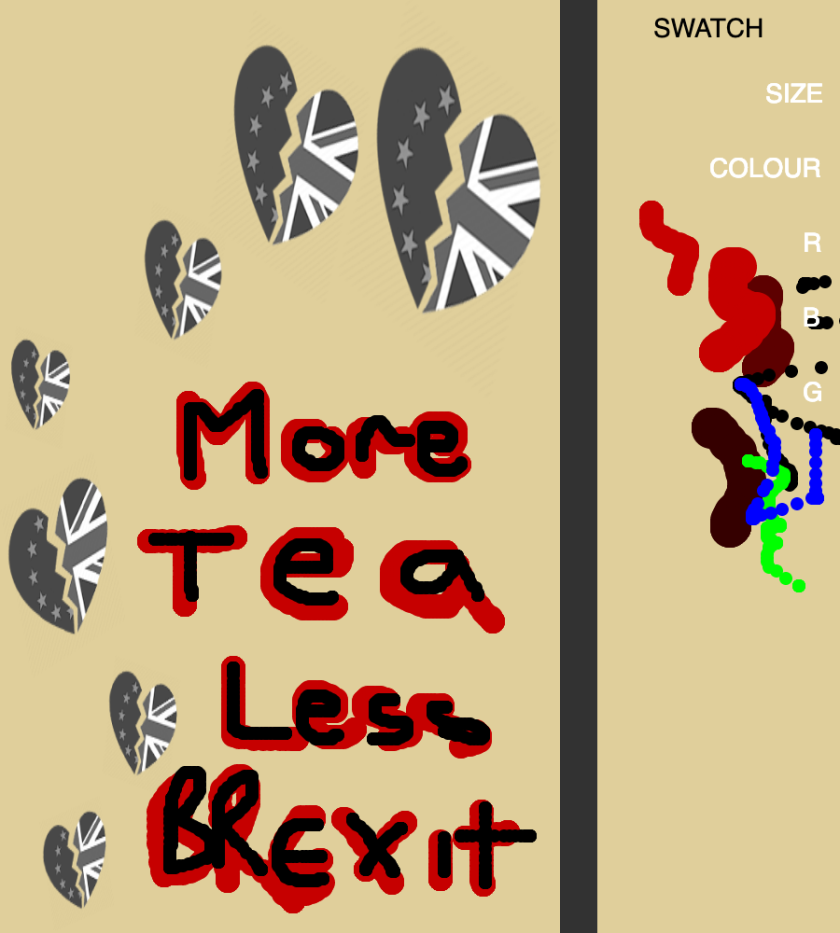
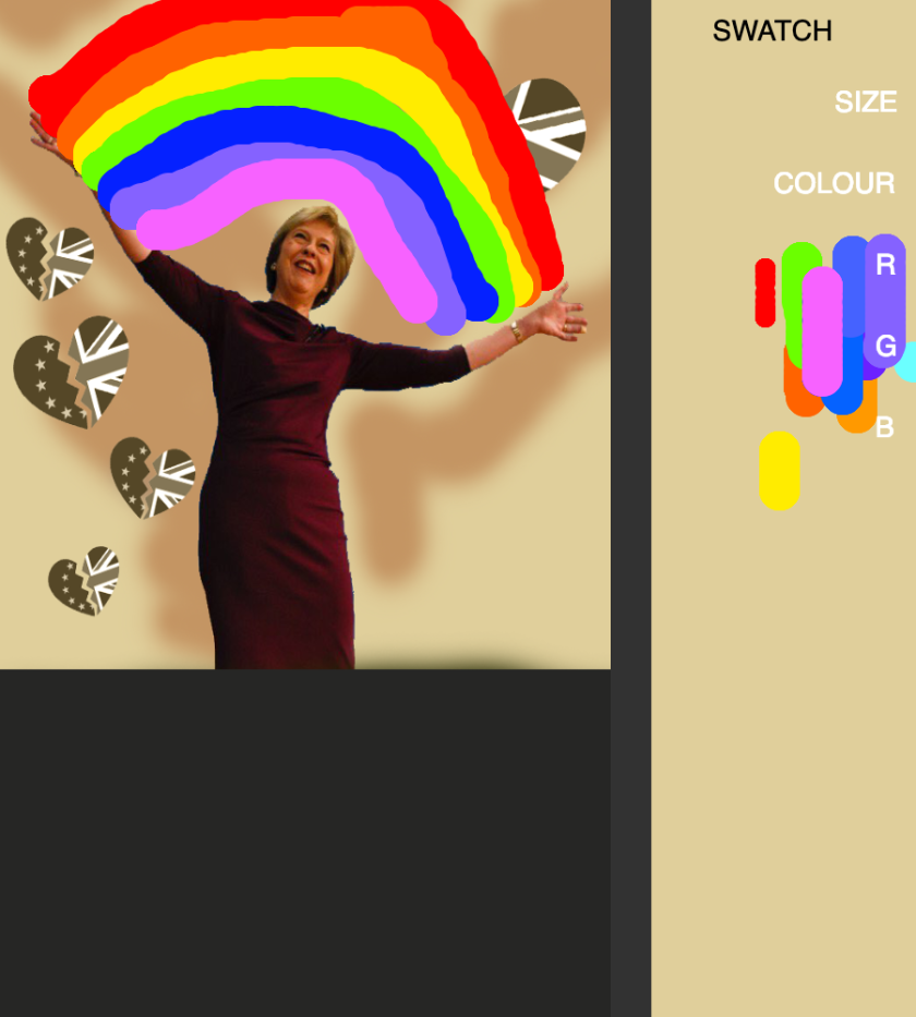
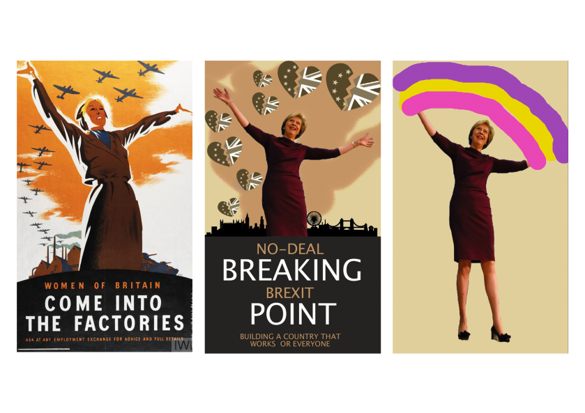
Theresa May / Come Into the Factories
This was probably the most complex poster to create, due to the multiple images and text layered in the code. The Poster is trying to recreate the originally, by focusing on things surrounding Brexit, as that is one of the most biggest event in British politics in years.


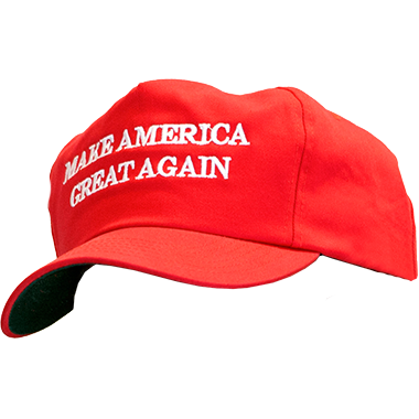
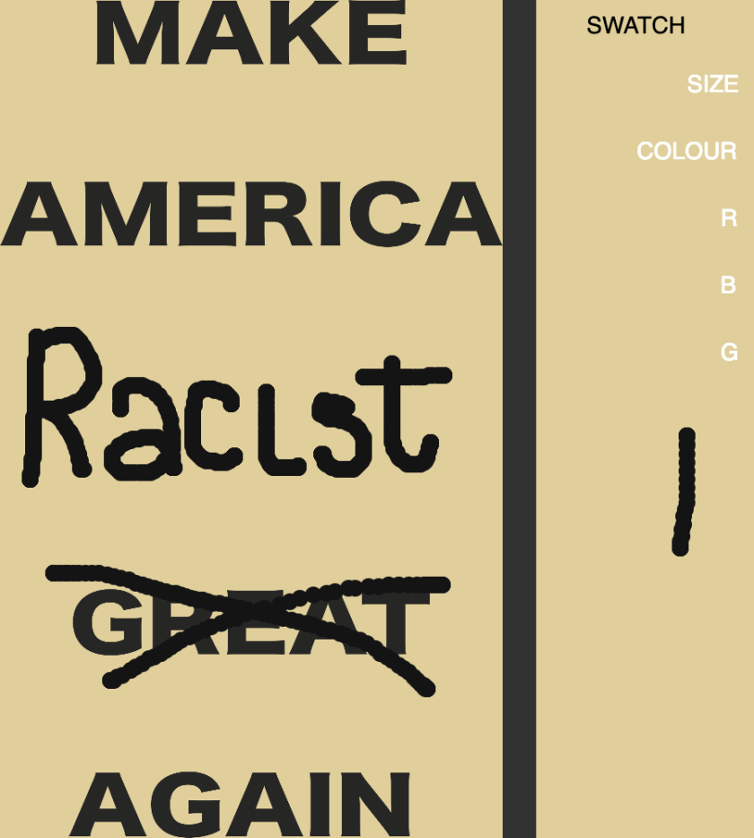
MAGA Cap / If The Cap Fits
This poster was probably the most mundane one to create, but i felt that as much as the ‘Make America Great Again’ Cap is a relevant object in today’s politics. I did not want to change the text, as I didn’t feel comfortable putting something, perhaps degrading, on the poster. As these supporters come from different backgrounds and have varying levels of commitment to their cause, and I didn’t want to stereotype anyone.

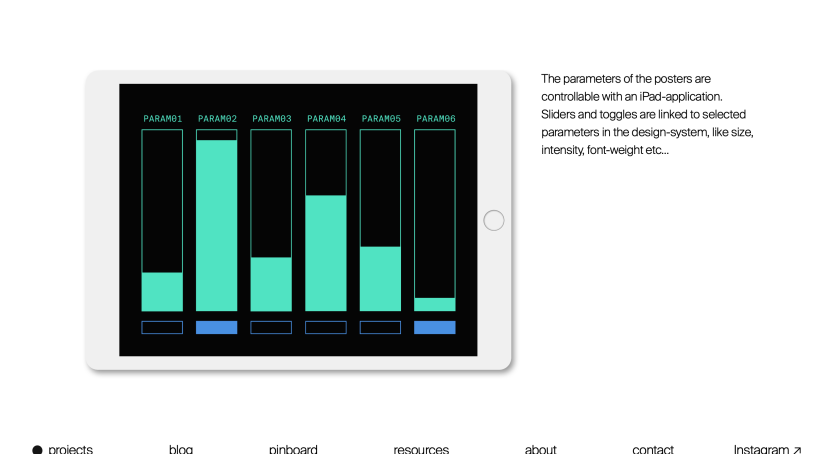
P5.JS
I have decided that I want to switch over to using P5.JS, to make my posters, interactive and create a more varied output in the work.
In creating the code I found it to be rather tricky altering it to allow me to draw but also have the images appear one at a time with a loop present. I resorted to using a createGraphics(); function , so that the images and the drawing would be on different canvases.
I also added buttons and sliders to add more variation and depth to the code.
Below are the Images in the code, that I used to help create the posters and for a point of inspiration for those who use the program.


When utilising the save(); function, I had some trouble with only getting the poster sized image. I eventually found a way using ; https://discourse.processing.org/t/p5-js-save-only-part-of-the-canvas/7286 . This allowed for the posters to be saved, but not at the best quality, so I decided that it would be better to take a save of the whole canvas and simply crop out the ‘swatch’ area.
Below are posters created by myself and others that have used my ‘Poster Generator’, a variety of results were created. Which I feel shows the different ways people can interpret the ‘Generator’.


Sketchbook


Final Examples – the pro


https://editor.p5js.org/kseivwright/full/DCU2amhbt
Overall, I am rather happy with how this project turned out, I feel that I have learned more about utilising P5.JS and have enjoyed this project. I feel like if I were to improve this piece, I would make it interactive with touch screen. I did try to implement some of touch features – that was learned during Web Fundamentals – but was unsuccessful. I make the decision that I would not implement the feature as I the layout it had on the computer screen better.
I feel that my Main Issue with this project, was my initially lack of imagination with what I could create back in September, and stuck with posters something I felt comfortable with.


Good progress with the beginnings of composing propaganda posters. Try reference closely the colour pallet, font and iconography of these historic posters. You can then add your own text from the present into these. However, the graphical visual should stay true to post-war propaganda to convey your message. Once you have a few more posters compiled in P’shop attempt to translate these in to processing or p5 so that eleme nts can be automated with your text. This gives you the opportunity to quickly produce multiples of these posters for presentation. Head to the library to see if there are books referencing the graphical rules you may want to imitate.